

A website concept for Tree Ring Legal, prepared by She Thrives Software Consulting. Your words, your colors, your logo.See it side by sideThe proposalGet started

Side by side

What changed, and why

Your site today next to the proposed one, with everything we found along the way. Scroll the page normally, there is nothing to drag.

The first screen

What somebody sees before they scroll

Both shots are the same size, taken on the same screen, cropped at the same point.

Today

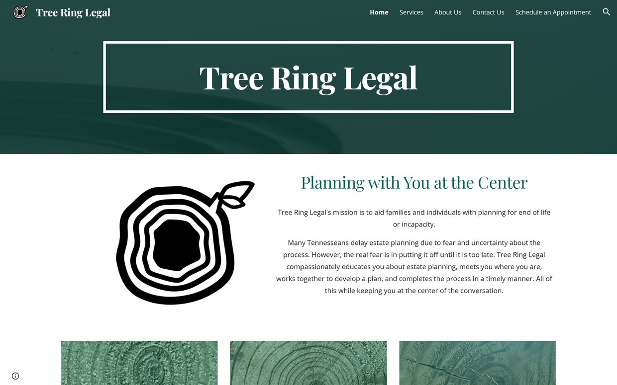
Current site
The current Tree Ring Legal homepage as it appears before scrolling

Proposed

New site
The proposed Tree Ring Legal homepage as it appears before scrolling

On a phone

Where most people will actually meet you

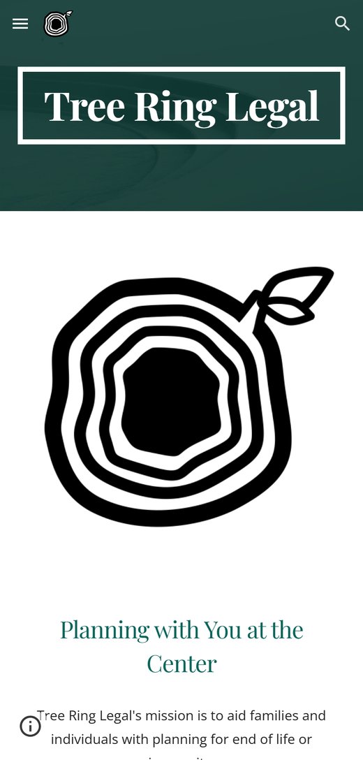
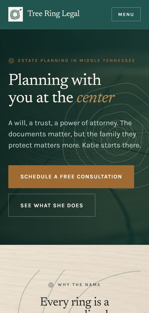
Your current site holds together fine on a phone. There is still no way for anybody to act on it.

Today

Current
The current homepage on a phone

Proposed

New
The proposed homepage on a phone

Top to bottom

The whole homepage

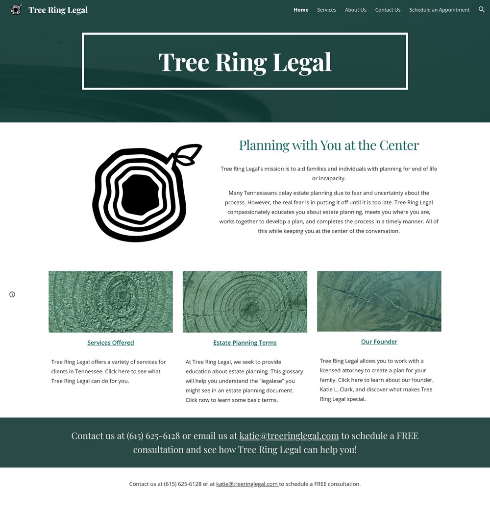
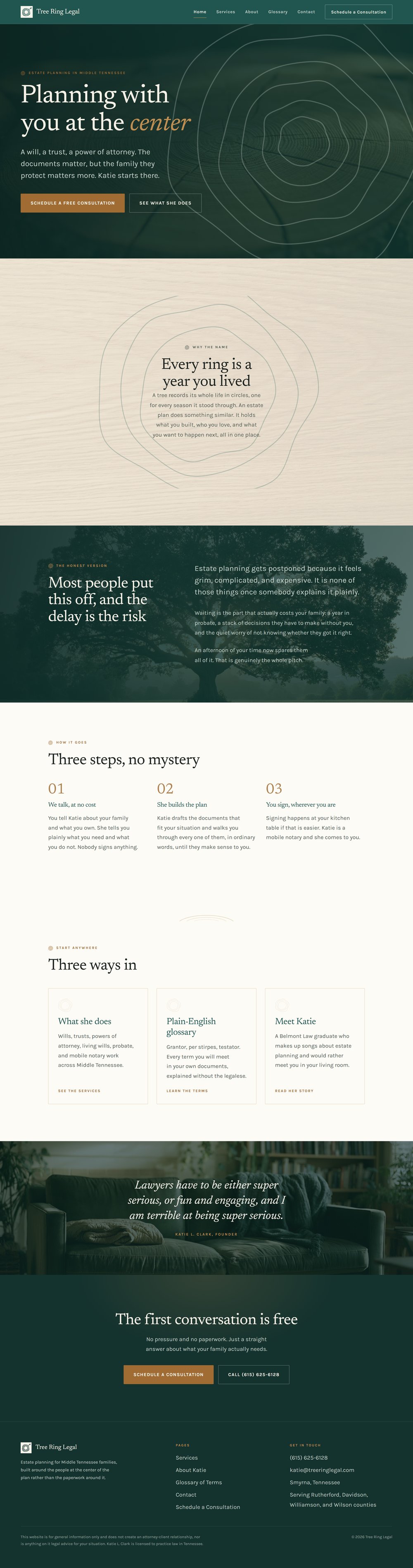
Your homepage today is about one screen of content. The proposed one runs roughly three and a half times longer, and every section of it is doing a job.

Today

Current site
The current Tree Ring Legal homepage from top to bottom

Proposed

New site
The proposed Tree Ring Legal homepage from top to bottom

The list

Seven things, worst first

I.
The big one

There is nothing on the site to click

Right now the only way to reach you is to read a phone number off the page and dial it by hand. There is no button anywhere on the site, no form, and no way for somebody to raise their hand at 10pm when they are lying awake thinking about this.

Estate planning is a decision people make late at night and act on later. If there is no way to start when the feeling hits, most of them will not come back to it.

II.
The big one

The "Schedule an Appointment" page is empty

The page in your navigation that should do the most work has nothing on it at all. A visitor who clicks the one link most likely to turn into a client lands on a blank page.

On the new site that page asks five short questions and sends the answers straight to your inbox. It is tested and working.

III.
Costing you clients

Ten five-star reviews, and none of them are on your website

You have a 5.0 rating on Google from ten people. Denton, Tina, Jody, and Anna all left real, specific reviews about the mobile office and about you explaining things in plain English.

None of that appears anywhere on your site. It is the single most persuasive thing you own and it is sitting somewhere your visitors have to go looking for it.

IV.
Technical

Typing your address without the "www" hangs and times out

Every modern browser tries the secure version of a web address first. When somebody types treeringlegal.com, the browser attempts it, gets no answer, and waits about twenty seconds before it gives up and falls back.

Only www.treeringlegal.com actually responds. This is a DNS setting and it takes a few minutes to fix once we have access.

V.

People cannot find out the basics

Your hours, your address, and the counties you cover are not on the site anywhere. Somebody deciding whether to call has to guess whether you serve them.

The new site says Monday to Friday, nine to five, based in Smyrna, working across Rutherford, Davidson, Williamson, and Wilson.

VI.

Your glossary deserves to be a real page

The plain-English glossary is genuinely the best thing on your site and the most useful thing you have written. It is currently a wall of text.

On the new site it has its own reference layout with a jump list, so somebody holding a document with the word "per stirpes" in it can find that one term in about two seconds.

VII.

A handful of small typos

There are a few slips in the current copy, including "which to chose" and "we come you to provide" on the services page. They are already corrected in the new version.

None of your writing was rewritten. Your mission, your bio, and every glossary definition are your words.

What it costs to make this the real thing

The whole proposal is one page.